Howdy, Stranger!
It looks like you're new here. If you want to get involved, click one of these buttons!
Making a mobile friendly UI - few snags

Ahoy,
First off, I'm using sugarcube 2.17.0 in Twine 1.4.2, and apologies in advance for the lengthy post.
I've been fidding with twine on and off for about a year, and I'm hoping to finally get around to making a proper project. I'm working on a game with the aim being mobile.
I want to get the basics of the UI sorted before I delve too deep into the project, and have hit a couple of snags along the way.
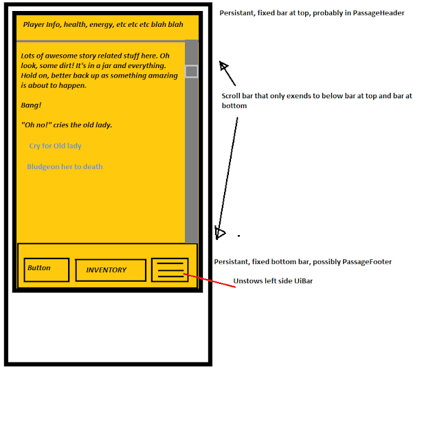
So, far, I've got what I want for some main parts (backgrounds, button styling and the like, but what I'm aiming for is a fixed, static UI Bar at the top of the screen and at the bottom of the screen, which are always visible and does not flicker with passage transitions, like how the UIbar normally works. Something along the lines of...
I've been scouring the forums for some idea of how to achieve the top and bottom bar , but so far have come up with little that has been able to get me going on the right track.
Does anyone have any experience in trying to achieve this or able to point me in the right direction?
For reference; I have the left UIBar active but hidden off screen to the left, which is sprung out by a button which I would put on the bottom fixed bar. The only CSS I've used is to alter the UIBar (to make the UIbar take the whole screen when active, and hide entirely when not) and some backgrounds and button stylings.
First off, I'm using sugarcube 2.17.0 in Twine 1.4.2, and apologies in advance for the lengthy post.
I've been fidding with twine on and off for about a year, and I'm hoping to finally get around to making a proper project. I'm working on a game with the aim being mobile.
I want to get the basics of the UI sorted before I delve too deep into the project, and have hit a couple of snags along the way.
So, far, I've got what I want for some main parts (backgrounds, button styling and the like, but what I'm aiming for is a fixed, static UI Bar at the top of the screen and at the bottom of the screen, which are always visible and does not flicker with passage transitions, like how the UIbar normally works. Something along the lines of...
I've been scouring the forums for some idea of how to achieve the top and bottom bar , but so far have come up with little that has been able to get me going on the right track.
Does anyone have any experience in trying to achieve this or able to point me in the right direction?
For reference; I have the left UIBar active but hidden off screen to the left, which is sprung out by a button which I would put on the bottom fixed bar. The only CSS I've used is to alter the UIBar (to make the UIbar take the whole screen when active, and hide entirely when not) and some backgrounds and button stylings.
body {

	color: #eee;
	background-color:;
	background: [img[images/parchment_background.jpg]] fixed;
}

.passage {
	line-height: 1.15em;
	font-family: "Consolas";
		}

button {
	cursor: pointer;
	color: #000000;
	background-color: #ffcc99;
	border: 1px solid #eee;
	line-height: normal;
	padding: 0.4em;
	transition-duration: 200ms;
	user-select: none;
	border-width: 2px;
	border-radius: 3px;
	border-color: #000000;
}
button:hover {
	background-color: #ff9966;
	border-color: #000000;
	border-width: 2px;
	border-radius: 3px;
}

button:disabled {
	cursor: not-allowed;
	background-color: #eee;
	border: 1px solid #eee;
}

#ui-bar.stowed ~ #story {
		margin-left: 1.0em;
		margin-right: 1.0em;
	}

#ui-bar {
	position: fixed;
	z-index: 50;
	top: 0;
	left: 0;
	width: 100%;
	height: 100%;
	margin: 0;
	padding: 0;
	transition: left 0.4s ease-in;
	border-right: 0px;
}

#ui-bar.stowed {
	left: -100%;
	}

#story {
	color: #000000;
	}


#title {
	font-family: "PirataOne-Regular";
	font-size: 120%;
	{
Comments
Adding your own HTML UI element to the page layout is fairly simple, as is associating a Passage with that element so that the contents of the passage are automatically displayed at the end of passage transition.
1. Create UI elements using Javascript in your story's script tagged passage:
var story = $("#story");
$('<div id="story-header"></div>').insertBefore(story);
$('<div id="story-footer"></div>').insertAfter(story);
... the above adds two HTML div elements to the page, the one with an ID of story-header is inserted just before the existing #story element, and the one with an ID of story-footer directly after the #story element.2. Create two new Passages in your story to contain the content to be displayed within the two new HTML elements, the first passage should be named StoryHeader and the second StoryFooter.
3. Associate the two new passages with their HTML elements using Javascript in your story's script tagged passage:
postrender["Display Story Header & Footer Contents"] = function (content, taskName) {
	setPageElement('story-header', 'StoryHeader');
	setPageElement('story-footer', 'StoryFooter');
};
4. Use CSS within your story's stylesheet tagged passage to style the two new HTML elements:
The CSS required to transfer the browser's scroll to the passage area in a way that works consistently in all web-browsers is beyond my knowledge, as is the related CSS needed to consistently position the new header and footer sections once the scroll bar has be transferred. I found that absolute positioning did not always work but that could be due to my limited knowledge.