Centering Passages in Harlowe

Using Harlowe, I'm trying to fix the passage width to 1024 pixels with no sidebar and have it centered on the screen.
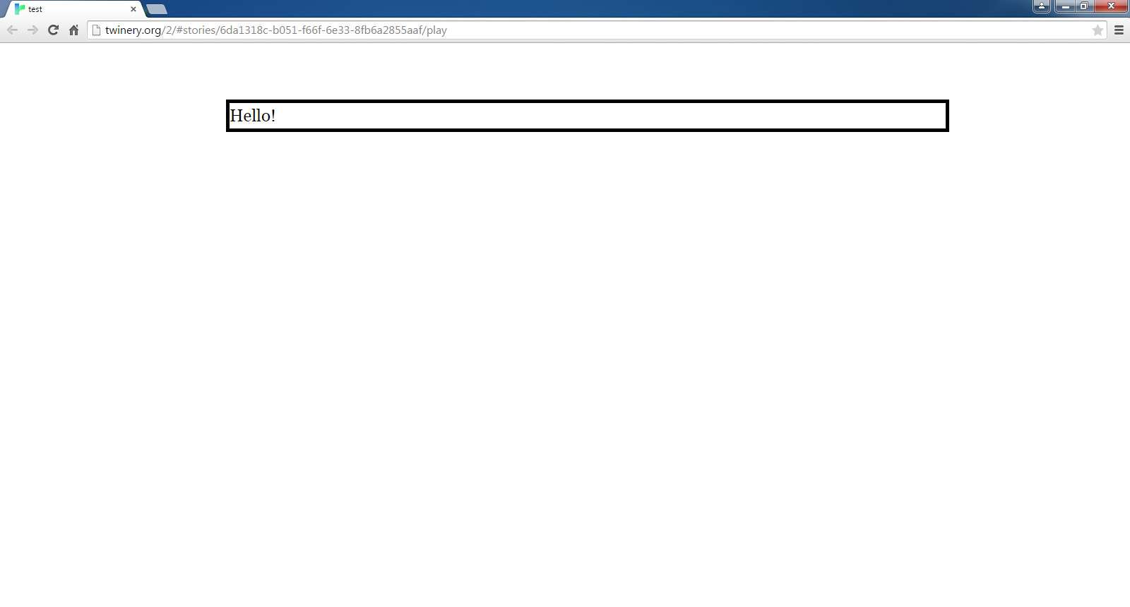
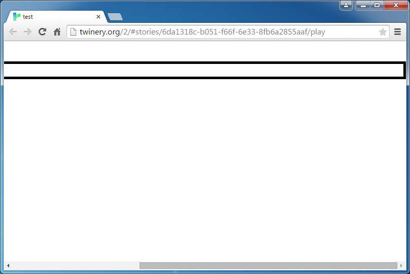
I'm having difficulty. No matter what I've tried so far, the passage appears slightly to the right, or all the way to the right when windowed or on a mobile device. I put a border around the passage for testing purposes.
The reason I'm doing this is because on a mobile device, the passage width is too "skinny" for my taste. Not much is on the screen. I want to make it a fixed width so I know exactly what players see.
I believe the passage selector is "tw-passage."
I have the "tw-sidebar" selector set to "display: none".
I've tried all sorts of margins (including margin-right, margin-left, etc.) and paddings, from 0 to 100px to auto, to % and em's, but it's always moved over to the right on my screen using the latest versions of Chrome, Firefox, and IE, Windows 7x64, as well as the latest version of Chrome on my iPhone6, which has the latest IOS.
It appears to be a bit right when maximized on a "normal" modern PC screen resolution (mine's 1600x900). However, with the screen windowed, or on a small resolution such as a mobile device like my iPhone, it gets pushed all the way to the right.
I'm by no means a CSS expert. All I know is what little I taught myself reading Internet guides and such for use with Twine.
Again, I'm just trying to set the passage width to 1024 with no sidebar and have it centered on the screen.
Thanks!
EDIT: Images:
Maximized:
Windowed:
I'm having difficulty. No matter what I've tried so far, the passage appears slightly to the right, or all the way to the right when windowed or on a mobile device. I put a border around the passage for testing purposes.
The reason I'm doing this is because on a mobile device, the passage width is too "skinny" for my taste. Not much is on the screen. I want to make it a fixed width so I know exactly what players see.
I believe the passage selector is "tw-passage."
I have the "tw-sidebar" selector set to "display: none".
html {}

body
{
	padding: auto;
        margin: auto;
}

tw-story {}

tw-passage
{
	border-style: solid;
	border-width: 5px;
	padding: auto;
        margin: auto;
	width: 1024px;
	color: white;
}

tw-sidebar
{
	display: none;
}
I've tried all sorts of margins (including margin-right, margin-left, etc.) and paddings, from 0 to 100px to auto, to % and em's, but it's always moved over to the right on my screen using the latest versions of Chrome, Firefox, and IE, Windows 7x64, as well as the latest version of Chrome on my iPhone6, which has the latest IOS.
It appears to be a bit right when maximized on a "normal" modern PC screen resolution (mine's 1600x900). However, with the screen windowed, or on a small resolution such as a mobile device like my iPhone, it gets pushed all the way to the right.
I'm by no means a CSS expert. All I know is what little I taught myself reading Internet guides and such for use with Twine.
Again, I'm just trying to set the passage width to 1024 with no sidebar and have it centered on the screen.
Thanks!
EDIT: Images:
Maximized:
Windowed:
Comments
html { padding-left: 10px; padding-right: 10px; margin-left: 10px; margin-right: 10px; } body { padding-left: 10px; padding-right: 10px; margin-left: 10px; margin-right: 10px; } tw-story { padding-left: 10px; padding-right: 10px; margin-left: 10px; margin-right: 10px; } tw-passage { border-style: solid; border-width: 5px; width: 1024px; padding-left: 10px; padding-right: 10px; margin-left: 10px; margin-right: 10px; }{ border-style: solid; border-width: 5px; padding: auto; margin: auto; max-width: 1024px; color: white; }Let me know if that works for you.
I am quite new to all this, so I don't have any definite answers for you. Sorry. Just working with you in finding a solution.
You can also add a min-width to a size that would work well on a mobile device and still have control over what the player sees.
This is all for testing anyway. I'm just trying to figure out how to center the passage and chose 1024px to test.
An actual live version uploaded to the Interwebs? I could, but I'll attach an HTML file for now.
What's kinda scary is I tested this with the current beta of Harlowe and I think it worked (as in, I saw what I thought I should see), but there was no scroll bar at the bottom . . . Dunno.
EDIT: Also, I tried setting max-width as well as width and it didn't change.
Sorry Sharpe, I should have gone with my instincts, because I thought originally the issue was with tw-story and not tw-passage.
Try this:
tw-story {
  width: 1024px;
}
I hope this is what you are looking for.
tw-story {
	width: 1024px;
	padding: 0px;
	border-style: solid;
	border-width: 5px;
}

tw-passage {
	margin: 0px;
	padding: 0px;
}

tw-sidebar {
	display: none;
}
But I would also look at using media queries to setup css rules for particular screen sizes. Here are some examples for iPad and iPhones
tw-story { margin: 0; padding: 0; white-space: normal; width: 100% }Thanks, Greyelf! That does appear to have done the trick!
Much appreciated, and thanks to everyone for the help!